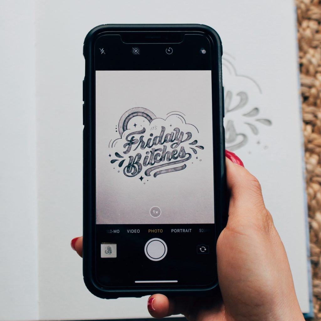
So I thought it might be super helpful if I provided some tips on photographing your lettering. I tend to see lettering on Instagram that looks really good but then images are too dark or blurry! D: This little face is how I feel when I see that. But hey! Not to worry! I actually would do the same too when I started lettering. I would just snap a photo and bam! Post it right away. There’s nothing wrong with that (I’ll admit sometimes I still do it) but I would say if you take more time and use these tips you will find that your lettering presentation will look soooo much better! Hey.. you might even get more eyes on your work! So with that here are my tips!
TIPS FOR PHOTOGRAPHING YOUR LETTERING:
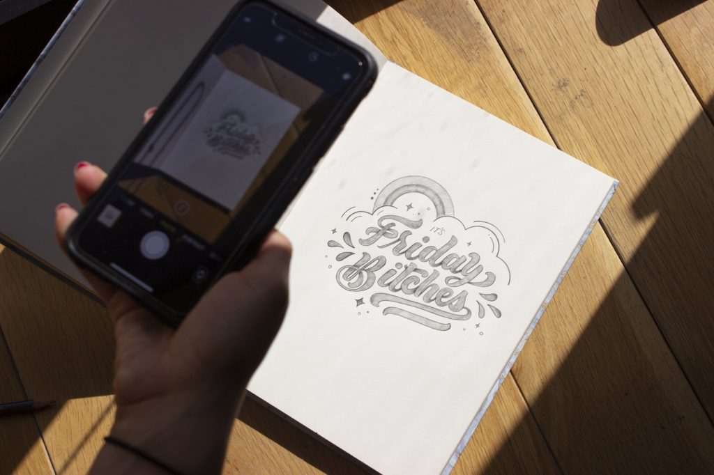
1. USE NATURAL LIGHT: So this is a BIG one for me. I’ve noticed when I take photos of my work during the day in natural light my lettering and presentation look 10x better. Try not to take photos of your work at night under a lamp. In my experience it just doesn’t look as good 🙁 As you can see below I found a piece of the sun peaking through the window and I started to take pictures of my work. See how good it looks?!
2. USE A FLAT SURFACE: This might not seem too big of a deal but try to place your work on a completely flat surface. This helps to prevent any shadows from appearing on your work. Let’s try to avoid all types of shadow. We just want to see your pretty lettering!
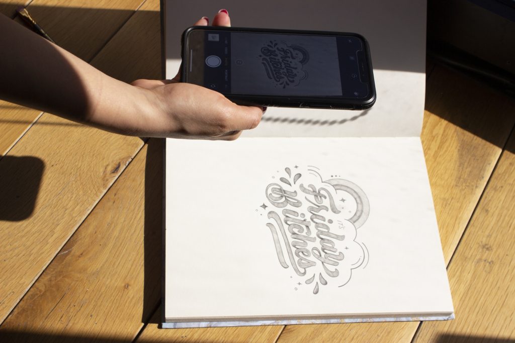
3. CONSIDER YOUR ANGLES: When you’re taking photos of your work try different angles! I find that when I take photos straight above my work my presentation is top notch ;o) But you might find you like a different angle and that’s totally fine but try to find what angles provide a better presentation. I recommend a top view 😀
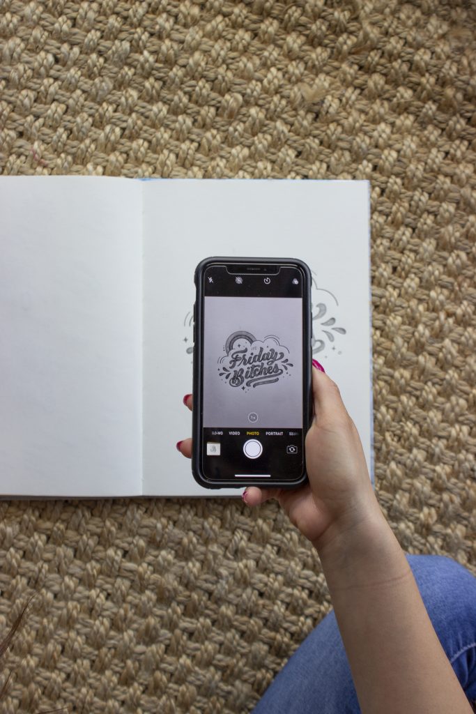
4. TAKE MULTIPLE PHOTOS: I recommend taking multiple photos of your lettering! It takes me some time to set up the area and find the right lighting so it’s super important for me that I have multiple shots to choose from. So take around 10 photos and then when you’re done you can look through them and find which ones show off your lettering the best! 🙂
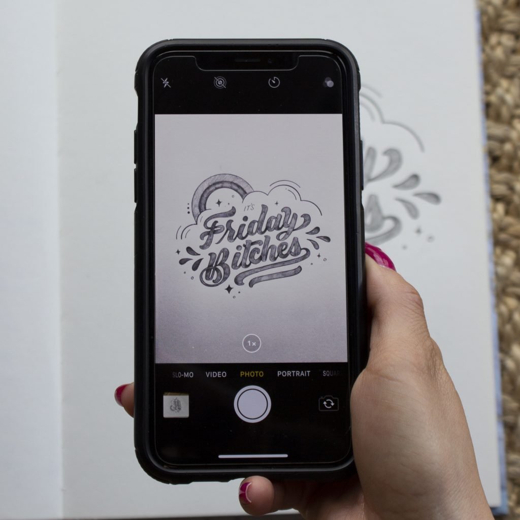
5. EDITING: I can’t say for sure but I would guess some of the best lettering artists out there are editing their photos to make sure everything looks good. I’ll take my photos to Photoshop and edit particles, shadows, and even lighting. This really helps to make your work super presentable. But if you don’t have access to Photoshop I recommend a simple editing tool. I love the VSCO App! I use it all the time for my photos. I recommend sticking to 1 Filter so that your Instagram has a noticeable “feel” or “brand.” Because I use the same filter over and over again the lighting on my photos look pretty much the same.
So those are my tips! I hope they are helpful and maybe you can use them for your own lettering! :o)

